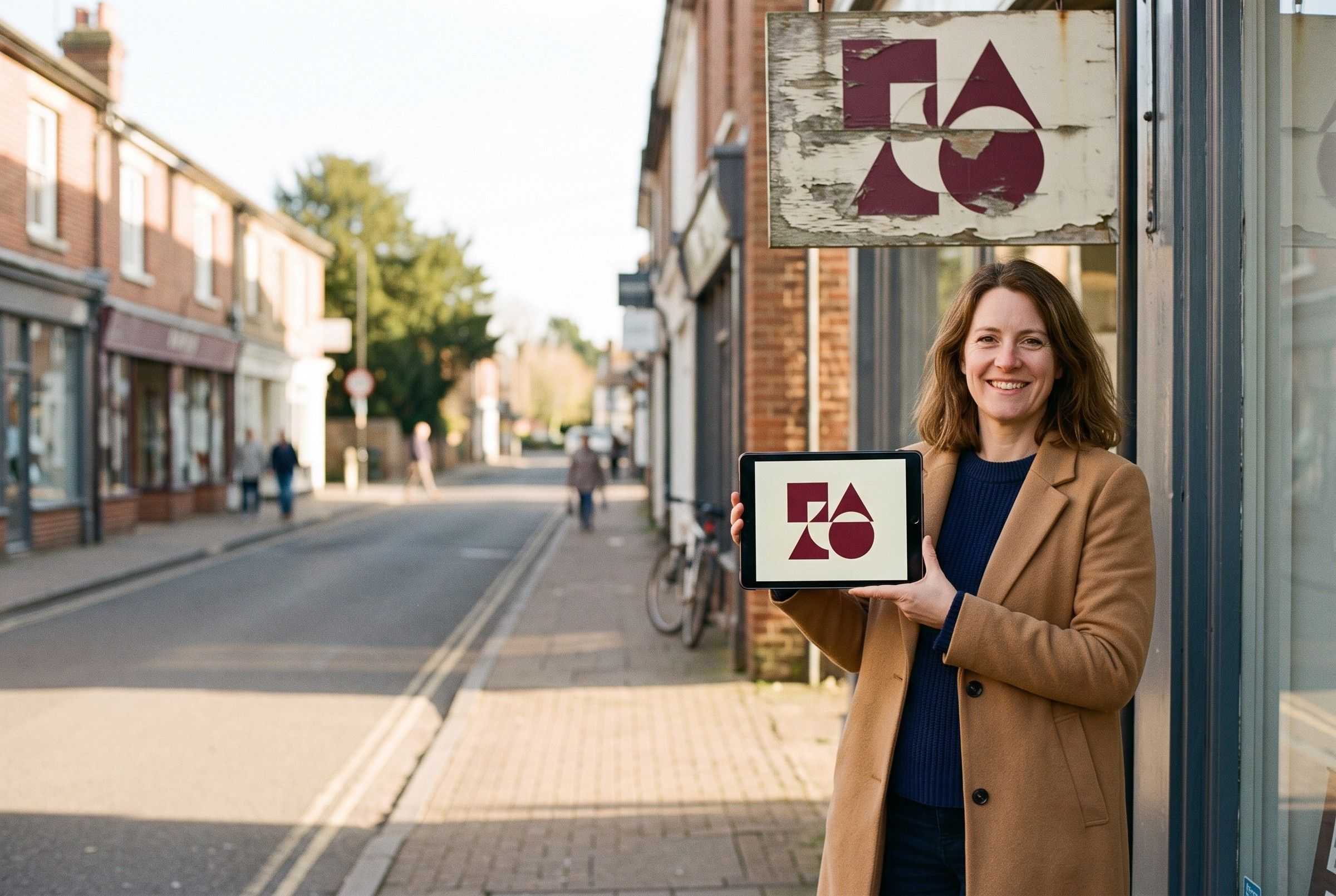
Your brand needs a refresh when it no longer matches the business you’ve become, looks dated or inconsistent, or stops working on the screens where customers find you. A refresh keeps what people already recognize and updates the rest, so you build on the trust you’ve earned instead of starting over. If the signs below sound familiar, start with an honest look at everything that carries your name.
Refresh or rebrand?
A brand refresh updates your look and message: a cleaner logo, a sharper color palette, better type, consistent photography and templates your team can use. A rebrand goes further and can change your name, your positioning or your whole identity. If customers already know and like you, a refresh is usually the right place to start. A full rebrand makes more sense when the name itself causes problems, such as confusion with another business, a merger or a move into work the old name can’t carry.
5 signs your brand needs a refresh
1. Your business has outgrown it
You’ve added services, raised your standards or started serving different customers, but your brand still reflects the early days. If you often find yourself explaining that you do more than people assume from your logo or website, your brand is underselling you. Check your words as well as your look: an old tagline or service list can hold you back as much as an old logo.
2. It looks dated, or like everyone else’s
Put your logo, website and social profile next to your closest competitors on a phone screen. If yours looks like it belongs to another decade, or you can’t tell the brands apart at a glance, your customers can’t either. Aim for distinctive and current, and skip trends that will date fast.
3. It changes from place to place
Several versions of the logo, colors that drift between print and screen and a new font on every flyer make it harder for customers to connect your sign, your posts and your website to one business. Without simple brand guidelines and templates, each new piece starts from scratch, which costs you time and consistency.
4. It breaks on small screens
Customers meet your brand in tiny spaces: a round profile photo, a browser tab, a search result. Google can show your favicon next to your site in search results and asks that it represent your brand visually, which is hard with a detailed logo shrunk down (Google Search Central, 2026).
Color matters too. The Web Content Accessibility Guidelines call for a contrast ratio of at least 4.5:1 for normal text and 3:1 for large text (W3C, 2023). Logos are exempt, but the text on your website, posts and menus isn’t. The U.S. Department of Justice lists poor color contrast among the web barriers that keep people with limited vision from reading content (ADA.gov, 2022). If your signature colors fail those checks when you set text in them, your palette needs work.
5. You hesitate to share it
You apologize for the website before you send the link. You hand out business cards reluctantly, or you avoid pointing people to your social profiles. Or the brand draws the wrong customers: you want bigger projects, but your look signals the budget option. Your brand should be something you’re proud to hand over.
Start with a quick audit
Gather everything that carries your brand: business cards, signs, vehicle graphics, packaging, invoices, email signatures, your website and each social profile. Put it all on one table, or screenshot it into one document. Mark every logo version, color and font you find, and note the pieces you’re proud of. The pattern shows you whether you need a light touch or a deeper refresh.
What a brand refresh usually includes
- An audit of every place your brand appears, from signs to social profiles
- Positioning and messaging: who you serve, what you promise and how you sound
- A refined logo, with simple versions for small spaces
- A color palette with accessible text pairings
- Typography for print and screen
- A photo and graphic style
- Brand guidelines and templates for social posts, print and presentations
How to refresh without losing recognition
- Keep your strongest assets. If customers know your color, a shape or your name, evolve around it instead of throwing it out.
- Test at real sizes. Check the logo as a profile photo, a favicon, a business card and a sign before you approve it.
- Check contrast for every text and background pairing you plan to use.
- Clear any new name or mark. Search the USPTO database before you invest. A mark that’s confusingly similar to an existing one for related goods or services is the most common reason the USPTO refuses registration (USPTO, 2023).
- Roll out in phases. Update your website, social profiles and Google Business Profile first, then print pieces and signs as you reorder.
- Tell your customers. A short announcement about what changed and why gives you a reason to reach out to past customers.
Once the brand is set, your website is the first place to apply it. Our small business website checklist covers what the site should include.
What a refresh can’t fix
A new look won’t repair a weak offer, slow service or confusing pricing, and customers notice when the brand promises more than the experience delivers. Fix those problems first, or alongside the refresh, so your new brand has something true to say.
Questions to answer before you start
- Who are your best customers today, and what do they need to believe about you?
- What do customers already recognize and like about your brand?
- Where does your brand show up most: phones, storefront, vehicles, packaging or print?
- What will the rollout cost, and what can wait until you reorder?
How AO can help
We start with strategy, then build a clear identity system and templates that work on your website, your social channels and in print. Learn more about our branding service, or contact us to talk about where your brand stands today.
Sources
- Define a favicon to show in search results, Google Search Central, 2026
- Understanding Success Criterion 1.4.3: Contrast (Minimum), W3C Web Accessibility Initiative (WCAG 2.2), 2023
- Guidance on Web Accessibility and the ADA, U.S. Department of Justice (ADA.gov), 2022
- Likelihood of confusion, U.S. Patent and Trademark Office, 2023
Quick answers
What is the difference between a brand refresh and a rebrand?
A refresh updates what you already have, such as refining the logo, modernizing colors and type and sharpening your message, while keeping what customers recognize. A rebrand changes the foundation, which can include your name, your positioning and your whole visual identity.
Should I change my business name during a brand refresh?
A refresh usually keeps the name. If a new name is on the table, search the USPTO trademark database and get legal advice before you invest, because a mark that's confusingly similar to an existing one for related goods or services is the most common reason the USPTO refuses registration.
How long does a brand refresh take?
It depends on scope. A focused refresh of the logo, colors and templates moves faster than a full rebrand with a new name, website and signage, and a phased rollout lets you update your most visible places first.